PhasePlots are the Best Plots
@ Stephanie Tonnesen | Sunday, Feb 21, 2021 | 2 minute read | Update at Sunday, Feb 21, 2021

A story on why I love PhasePlots.

Why PhasePlots are the BestPlots

This post is about the best plots, PhasePlots. I like PhasePlots because they really let you see how the variable describing your data are connected. Want to see if your data lies along a constant pressure line in the density-temperature plane? PhasePlots can do that! What to figure out why not all the gas falls along your line? Try coloring your data by tcool instead of cellmass! Try making a PhasePlot of tcool versus pressure. Try whatever you want, PhasePlot is ready.

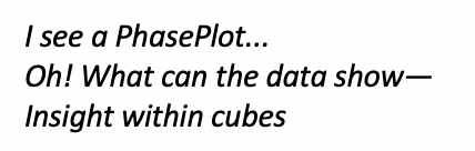
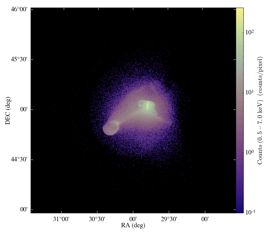
Here is my example from my recent paper: we came up with this nice model for how gas is accelerated from ram pressure stripped galaxies-by mixing with the intracluster medium wind! Here is a nice snapshot from our “wind-tunnel” simulation:

image

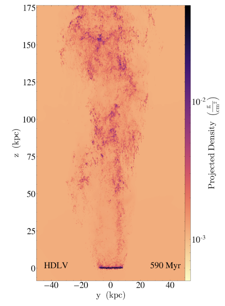
The simplest formula about the tail gas related gas velocity to the fraction of ICM gas. So we used PhasePlots to compare the gas from our simulation to our analytic model. Here are some code snippets next to the resulting PhasePlot:

image

Now I think that is an amazing agreement! But there is one glaring mismatch, the gas with high ICM fraction and low or negative velocities. Once again, PhasePlot came to our rescue. This time we looked at the gas velocity as a function of radial distance, with the colorbar based on this mixed fraction from the ICM.

image

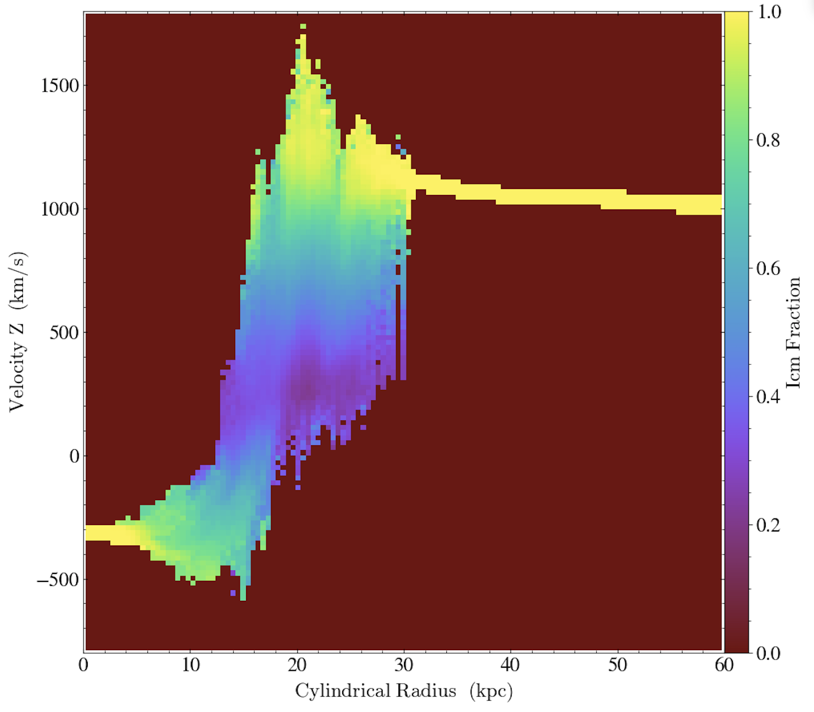
Ah-ha! The well-mixed gas with negative velocities is all at small radius–in fact, in comparison with the ProjectionPlot above, we see that it is all behind the disk, or in it’s “shadow” protected from the ICM wind! Our model does not account for fallback of this gas, so we can easily understand the mismatch between model and simulation.

I hope you enjoyed seeing this fun example of the power of PhasePlots, and so I leave you with this:

image

yt extension modules

yt has many extension packages to help you in your scientific workflow! Check these out, or create your own.

ytini

ytini is set of tools and tutorials for using yt as a tool inside the 3D visual effects software Houdini or a data pre-processor externally to Houdini.

Trident

Trident is a full-featured tool that projects arbitrary sightlines through astrophysical hydrodynamics simulations for generating mock spectral observations of the IGM and CGM.

pyXSIM

pyXSIM is a Python package for simulating X-ray observations from astrophysical sources.

ytree

Analyze merger tree data from multiple sources. It’s yt for merger trees!

yt_idv

yt_idv is a package for interactive volume rendering with yt! It provides interactive visualization using OpenGL for datasets loaded in yt. It is written to provide both scripting and interactive access.

widgyts

widgyts is a jupyter widgets extension for yt, backed by rust/webassembly to allow for browser-based, interactive exploration of data from yt.

yt_astro_analysis

yt_astro_analysis is the yt extension package for astrophysical analysis.

Make your own!!

Finally, check out our development docs on writing your own yt extensions!

Contributing to the Blog

Are you interested in contributing to the yt blog?

Check out our post on contributing to the blog for a guide!

We welcome contributions from all members of the yt community. Feel free to reach out if you need any help.

the yt data hub

The yt hub at https://girder.hub.yt/ has a ton of resources to check out, whether you have yt installed or not.

The collections host all sorts of data that can be loaded with yt. Some have been used in publications, and others are used as sample frontend data for yt. Maybe there’s data from your simulation software?

The rafts host the yt quickstart notebooks, where you can interact with yt in the browser, without needing to install it locally. Check out some of the other rafts too, like the widgyts release notebooks – a demo of the widgyts yt extension pacakge; or the notebooks from the CCA workshop – a user’s workshop on using yt.

Social Links